Today’s Tip
Keep focus on data by attending to details of border and map layout.
Discussion
Today’s tip comes out of an experience I had with our city manager. He stopped by to ask me to create a map for him, then asked if he could stick around and watch me while I did. Once I verified that I had the data available that he wanted to highlight, I went through my usual process of creating the layout, including border, title block, and other map elements, before I finalized the symbology and look of the major map features. In the process, he noticed that I was very detailed when setting up the dimensions of the border and title block, and the font sizes of various elements. I explained that by taking the time to ensure all of these elements are consistent and regular, they don’t then reach out and grab your eye when looking at the finished product. Instead, they fade to the background and let the desired focus of the map, shine through.
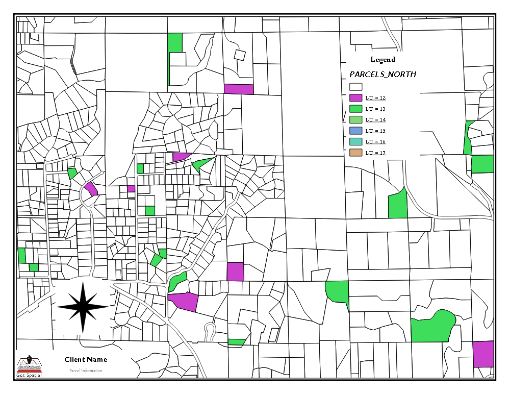
Here are two examples of the same map.

In this version, the map is not centered within the border. The title and some of the text are different sizes, fonts, weights and colors.
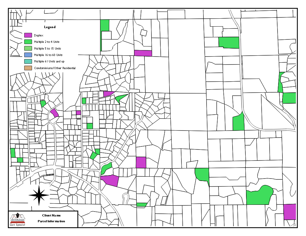
Now, look at the 2nd version.

In this one, each of these details has been made consistent. You have a centered map, consistent text sizes, weights and colors, and a balance of elements in different parts of the map. While no single one of these items might grab your eye directly, they are still distracting on some level. Your brain can see that something is slightly off, so distracts itself trying to figure out what. This takes away from the intended message of the map.
The subject of your map should be immediately apparent. All other elements should help to focus attention on the subject. Making th border, title, text and other elements of the map consistent, contributes to this effort.
Let me know your favorite map layout styles in the comments.