Today’s Tip
Use only the data layers you need to make your point
Discussion
This tip arises as a way of fighting the shiny object syndrome. You know how it goes, you get a new data layer, or new aerial photos, and you want to include them in everything. So, you do, whether they should be there or not. I’m here to tell you that your cartographic journey will be much less fraught, if you can resist this urge.
The whole point of maps is to convey information. Generally, the more focused your map is, the better it will be at doing this. Each element of the map should also perform this function, whether directly as the subject of the map, or indirectly, by bringing focus to the subject.
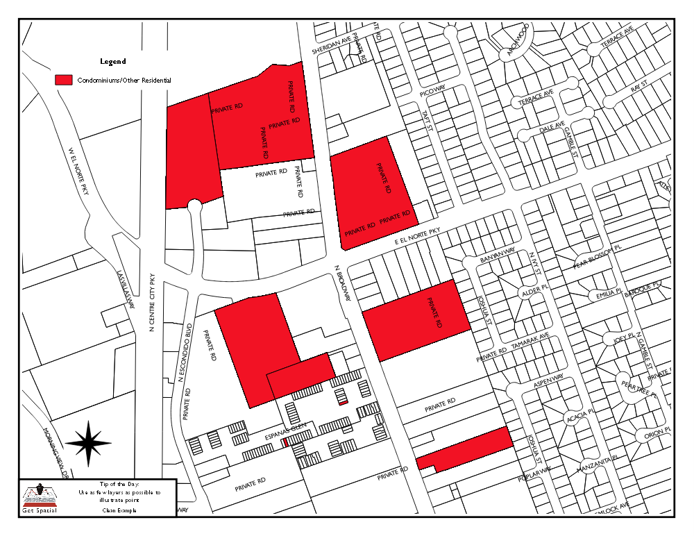
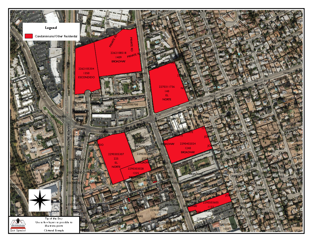
Let’s look at a couple of examples. The intent of both maps is to show properties that have residential condominiums on them.

In this first example, there are basically 2 layers, parcels, and roads. The roads are not shown, only the labels for them. The parcels are just shown as outlines, with those containing condos colored red. This makes for a very simple presentation. The road labels make it easy enough to determine where a particular parcel is located, and also give you an idea of the general area. Other than that, the map contains a simple layout, with border, title block, and legend.

In the second map, a new layer of aerial photos, and more labels, have been added. There are now labels in each parcel showing the address and assessors record.
Now, for the record, I am a big fan of aerial photos. They are a hugely effective tool for helping people locate where they are, and understand the context of items on a map. The question you have to ask, is whether the additional layers or labels, contribute anything to the understanding of the map. In this case, the aerial photo is almost too dark, and makes the whole map too busy, taking the focus away from the few parcels that contain condominiums. The labels add another layer of complexity. If you wanted to leave these features on, then perhaps limit the labels to just the targeted parcels, and add a transparency to the aerial photo so that it is lighter. This will make it more of the background feature it is supposed to be, instead of a focal point.
You could say, and be correct, that different people may see each of these maps, and think they are perfect. While this is true, you still have to start somewhere. I mentioned before that I am a fan of aerial photos. I always used to include them in maps that I would prepare. I did this until a couple of times when I was in a hurry, left them off, and the people the map was for, were perfectly happy. They even commented that the map looked cleaner, and didn’t really need the aerial to see what they wanted.
So, here is what I hope you take away from this whole discussion: Start small. Use as few layers on the map as necessary, with as few layers, to get the point across. Understand your audience enough to know when they may want/need something slightly more. Before you just give it to them, show them both options, and see what they like better.
That is my idea. Drop a line in the comments, and tell me your tactics for highlighting the topic of your maps.